How to Master Color Theory in Food Photography for Irresistible Bread Shots
People decide about food within 90 seconds of their first interaction, and color alone influences 90% of that decision.
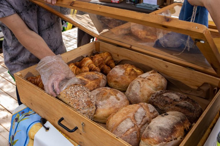
Many food photographers spend hours trying to capture the perfect bread photo. Yet they often end up with flat, unappetizing images that fail to showcase their freshly baked creations. Great scroll-stopping bread photos need the right camera or props and a solid understanding of color theory and food photography principles.
The most memorable food photos use carefully planned color combinations that make bread look warm, inviting, and irresistible. Color theory helps photographers create mouth-watering masterpieces through perfect background colors and expert food styling techniques.
Want to improve your bread photography? We’ll show you how color theory creates stunning food images that will water your audience’s mouths!
Understanding Color Theory Basics for Bread Photography
My early days of bread photography taught me that color theory goes beyond distinguishing reds from blues. Let me tell you how color theory helps turn simple bread photos into masterpieces that instantly make people hungry.
Primary and Secondary Colors in Bread Photography
Bread photography works with three primary colors: red, yellow, and blue. Sir Isaac Newton first identified these in his color experiments, and they are the foundations for all our bread photography magic. The combination of these primaries creates secondary colors—violet, green, and orange. These colors give us more creative options for working with crusty loaves and soft dinner rolls.
Using the Color Wheel for Bread Compositions
The color wheel helps me create stunning bread photographs. Here’s how I use it to boost bread’s natural beauty:
- Complementary Colors: Colors from opposite sides of the wheel work together – like golden bread against a blue backdrop
- Analogous Colors: Colors next to each other blend well, such as warm browns of bread with orange or red props
- Monochromatic Schemes: Different shades of one color highlight the bread’s textural details perfectly
Color Temperature and Its Effect on Bread Shots
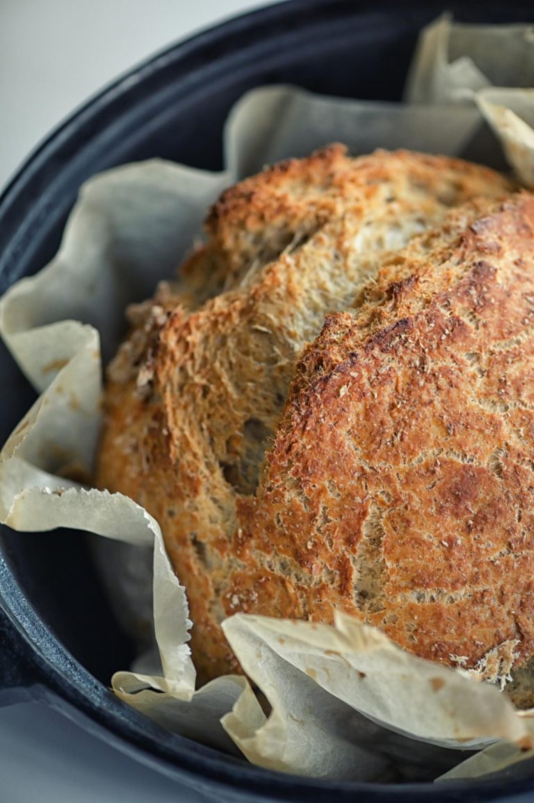
Color temperature plays a crucial role in making bread look appetizing in photos. Warm colors (reds, oranges, yellows) give the bread an inviting, fresh-from-the-oven look. Rustic loaves look best under warm lighting that highlights their golden-brown crusts. Artisanal breads sometimes need a balance of warm tones with cooler backgrounds to create visual interest.
Note that color does more than please the eye – studies show consumers judge food products by color first. This is why I make sure the bread’s natural colors stand out while using complementary elements to enhance its appeal.
Mastering Light and Color for Bread Photos
Light has always captivated me in food photography, especially when I take the perfect bread shot. My years of experimenting taught me that becoming skilled at lighting is just as significant as knowing color theory.
Natural vs Artificial Light Effects on Bread Colors
Natural and artificial light create different moods in bread photography. Natural light gives warmer, organic tones that make golden crusts of fresh bread look beautiful. But artificial light lets me have more control and consistency, especially in tough shooting condharshs.
Here are my proven lighting tips for bread photography:
- Position bread at 45 degrees to your light source to get the optimal texture
- Use diffused light to minimize harsh shadows on crusty surfaces
- Think about the time of day for natural light shots
- Match your light temperature to your bread’s warm tones
Managing Color Cast in Different Lighting Conditions
Different lighting situations need different approaches to handle color casts. Fluorescent lights can add an unflattering greenish tint to bread, while tungsten lighting often makes it look too warm and yellow. Understanding how each light source affects your bread’s natural colors is critical.
Color Correction Techniques for Bread Photography
RAW format is my non-negotiable starting point for serious bread photography. This format gives me the most flexibility to adjust white balance and color temperature during post-processing. Proper monitor calibration is vital—without it, those beautiful golden-brown crusts might look different to your audience than you intended.
My favorite technique uses color temperature adjustment to improve bread’s natural warmth while keeping realistic tones. Note that our goal isn’t to create unrealistic colors but to show bread in its most appetizing form.
Creating Color Harmony with Bread as the Star
Taking stunning bread photographs resembles conducting a visual symphony where every element creates pa erfect harmony. Over the last several years of food photography, I’ve found that making bread the star requires careful attention to color relationships.
Complementary Color Schemes for Different Bread Types
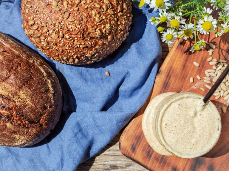
Different breads just need different color approaches. Rustic sourdough’s deep brown crust looks striking against cool blues or turquoise backgrounds. Golden hues of lighter bread like brioche or challah pop beautifully against deeper, richer tones. The key is to avoid pure primary colors since they can cause color contamination and reflect unwanted tints onto your bread.
Background Color Selection Principles
Simplicity guides my background selection process. Cool, neutral, and desaturated backgrounds make bread look fresh and vibrant. Here are my proven tips tfor selectingbackgrounds:
- Choose wooden backgrounds to add versatility and natural texture
- Opt for matte surfaces to prevent unwanted reflections
- Select backgrounds that complement your bread’s dominant color
- Avoid busy patterns that compete with your subject
Props and Styling Elements Color Coordination
The “less is more” philosophy works best with props and styling elements. Neutral-colored serve ware lets bread shine while adding depth to compositions. The goal is to boost, not compete with, your star subject.
Ceramics have become my preferred choice because they reflect less light than other materials. Shallow bowls and plates allow natural light to hit all areas evenly. Hand towels and napkins can introduce subtle texture without overwhelming the frame.
Note that creating color harmony extends beyond choosing attractive colors. It’s about understanding how different elements work together to tell a cohesive story that makes your bread photography truly appetizing
Advanced Color Techniques for Bread Photography
My bread photography reached new heights when I started exploring advanced color techniques. Years of testing showed me that these sophisticated approaches could turn good-bread photos into stunning masterpieces.
Working with Monochromatic Color Schemes
Monochromatic schemes create magic in bread photography, especially with shades of brown. Various tones of one color add depth and dimension, making bread look irresistible. Dark chocolate and sandy tones paired with classic white create perfect contrast. This mix results in sophisticated images that raise the quality of any bread photograph.
Using Color Psychology to Boost Appetite Appeal
The way colors affect appetite has revolutionized my bread photography. Here’s what colors can do to stimulate appetite:
- Warm colors like orange and yellow create feelings of comfort and warmth
- Earth tones evoke wholesomeness and reliability
- White suggests purity and cleanliness
- Browns communicate rustic authenticity
Careful color balance plays a significant role – too many competing hues can overwhelm viewers and reduce appetite appeal.
Color Grading in Post-Processing
Post-processing lets me fine-tune the color story of my bread photographs. The key is subtle enhancement, not dramatic transformation. My focus stays on:
- Adjusting color temperature to boost bread’s natural warmth
- Using curves to deepen shadows and brighten highlights
- Fine-tuning saturation levels for specific color ranges
- Balancing exposure to maintain natural bread colors
Note that unrealistic colors aren’t the goal – we want to enhance what’s naturally there. Desaturating certain colors can be just as powerful as increasing saturation. The bread’s texture needs special attention during editing to ensure color adjustments preserve those beautiful crusty details that make bread photography appealing.
Careful color grading preserves images’ appetizing appeal while adding professional polish that makes viewers want to grab a slice right off the screen.
Conclusion
Color theory reshapes ordinary bread photos into compelling visual stories that instantly make viewers hungry. Learning these techniques has shown me that successful bread photography needs a combination of careful color selection, thoughtful lighting, and smart post-processing.
Great-bread photos need complementary colors, well-chosen backgrounds, and an understanding of lighting’s effect on the final image. The difference between average and exceptional bread photography lies in subtle adjustments to color temperature, thoughtful prop choices, and precise attention to monochromatic schemes.
These color theory principles are easy to implement. You can begin with a single technique and experiment with various backgrounds to see your bread photography improve.
Stunning bread photography emerges from the consistent application of color theory principles. As you practice these techniques and trust your creative instincts, your bread photos will become more appetizing and professional with each shot.
FAQs
What does color theory entail in food photography?
Color theory in food photography involves using specific color schemes to enhance visual appeal. These include monochromatic colors (black and white), complementary colors (red and green, yellow and purple, orange and blue), and analogous colors, which are groups of three colors adjacent to the color wheel.
What colors are most effective in food photography?
In food photography, a balanced palette that includes both warm and cool colors tends to be most effective. For instance, red and dark green can balance brown and light blue shades, while yellow and white can add a vibrant pop to the center of the composition.
How can one become proficient in food photography?
To master food photography, start by utilizing natural light and the camera you already own. Familiarize yourself with different shooting angles and the Rule of Thirds. Incorporate the color wheel to enhance your compositions, use props effectively, and develop a unique photographic style.
Which color plates should be used in food photography to make the food stand out?
For food photography, it’s best to use plates in neutral colors such as white, beige, gray, blush, blue, natural wood, and occasionally black. These subdued tones help ensure that the food remains the photograph’s focal point rather than the plate or linen.